A premium DTC skincare brand built to compete on design from day one

A category where the brand is the product
Premium skincare is one of the few categories where credibility, packaging, and visual identity drive purchase decisions as much as the formulation itself. A product can be excellent and still fail if the brand doesn't carry the visual weight expected at that price point.
SKN Labs was a fully owned brand — custom-formulated from the ground up, which meant no white-label shortcuts and no existing equity to build on. Everything had to earn its place: the name, the positioning, the packaging, the campaign, and the eCommerce experience all had to work together from day one.
Scandinavian minimalism meets DTC precision
I built SKN Labs as the most complete brand AvantGarde had launched — designed and executed across every touchpoint, from identity system through to the physical packaging in a customer's hands. The positioning was Scandinavian-inspired: clean, confident, ingredient-led, and deliberately minimal. A brand that let the product do the talking.
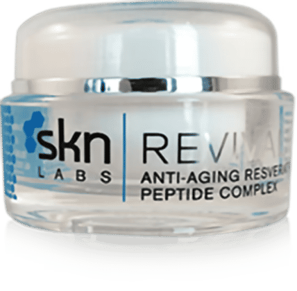
Packaging was central. I designed the full jar and label system, sourced physical components to match the quality specification, and oversaw production — keeping the brand experience consistent between what the campaign promised and what the customer received.
A launch-ready brand built to scale
SKN Labs launched successfully and validated strong product performance with its early customer base. The brand system, packaging, and eCommerce platform were built to scale — with additional investment, the platform had clear runway to expand significantly into a growing category.
SKN Labs represented the most brand-complete product AvantGarde Brands had built: custom-formulated, professionally packaged, fully designed, and sold as a wholly owned brand from day one. A proof that a small team with design discipline can build something that competes with established players on brand alone.
The Scandinavian-inspired positioning informed every design decision — clean, minimal, precise. The visual identity was built to communicate clinical credibility without feeling cold, and premium quality without feeling inaccessible. I developed the full brand system including identity, typography, colour palette, and brand guidelines applied consistently across packaging, print, digital, and campaign materials.
- Full brand identity — logo, color, typography, tone of voice, and brand guidelines
- Packaging system — jar, label, and outer pack design and supplier sourcing
- Campaign creative — digital and print assets, product photography direction
- eCommerce site — product pages, checkout flow, and front-end development
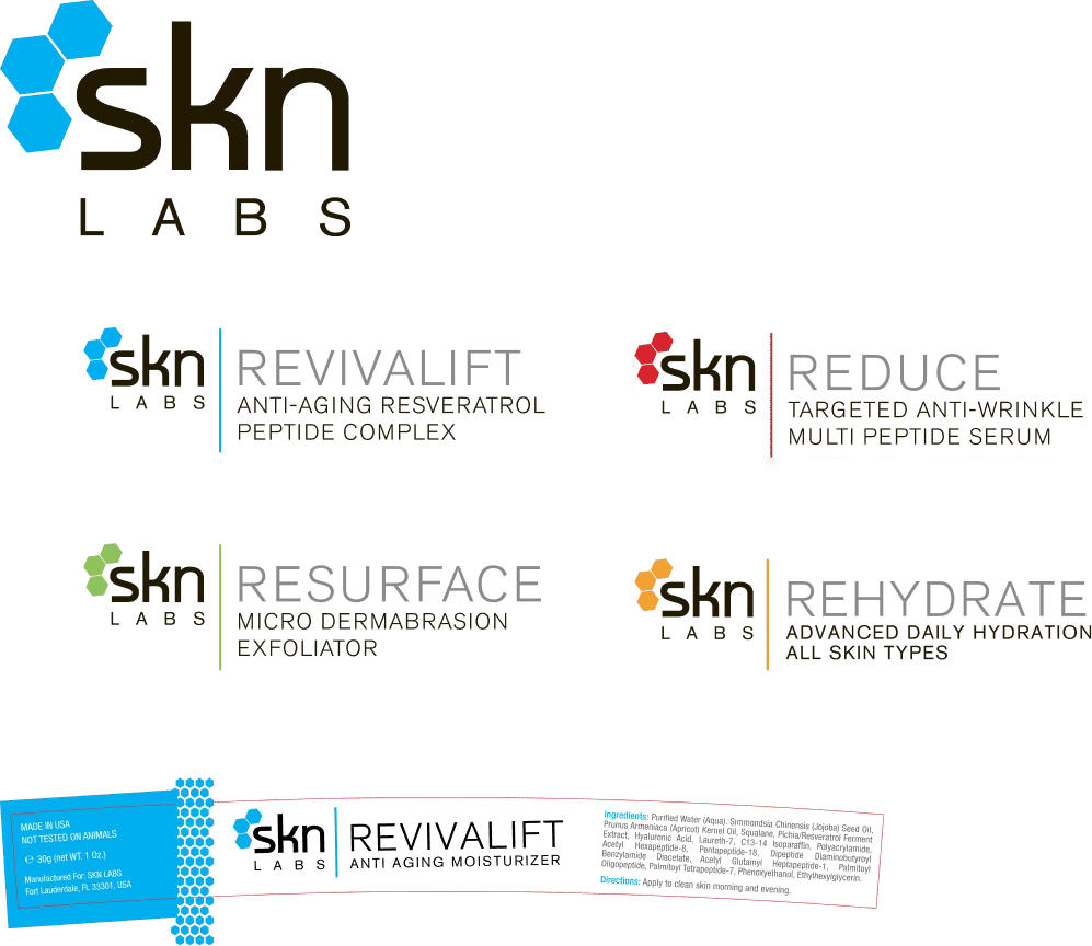
I designed the full jar and label system — and sourced the physical packaging. This meant working directly with suppliers to select materials and finishes that matched the brand's premium positioning, and designing labels that worked within those constraints. The result was a cohesive product line where every element of the physical package reinforced the brand story.
- Jar and label system design
- Packaging supplier sourcing and specification
- Print-ready production files across all SKUs
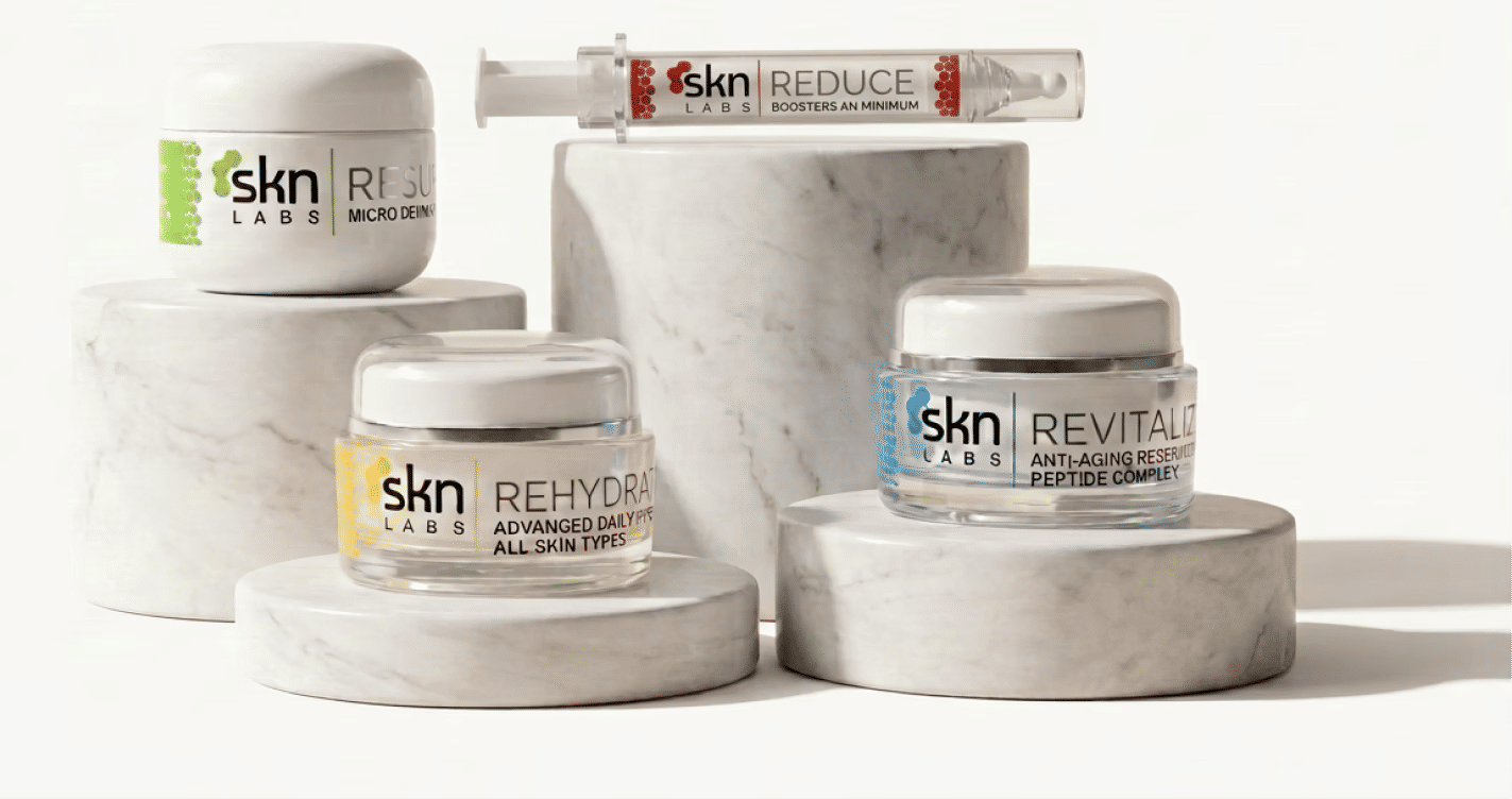
As campaign traffic grew, we built a direct-to-consumer web experience to capture organic and paid demand. I designed and built the front-end — a clean, editorial experience that presented the product line in context and moved customers efficiently from awareness to purchase.
- eCommerce front-end design and development
- Product pages and checkout flow
- Visual design consistent with brand system
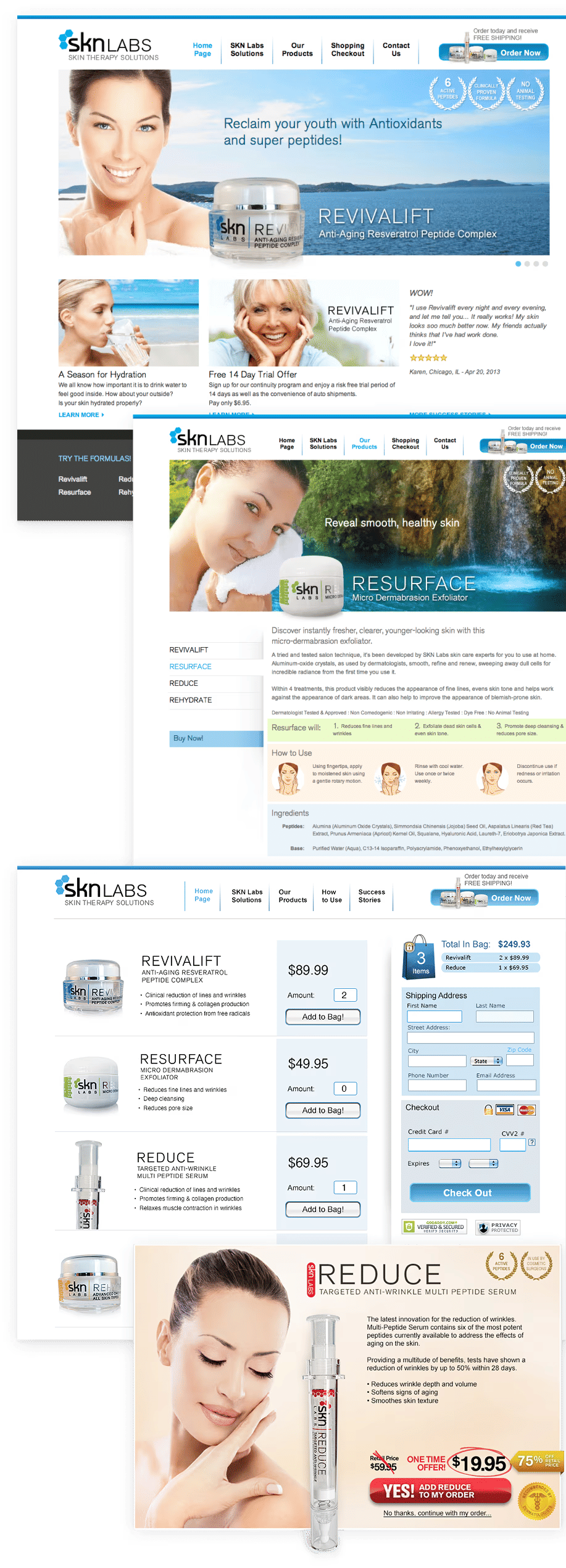
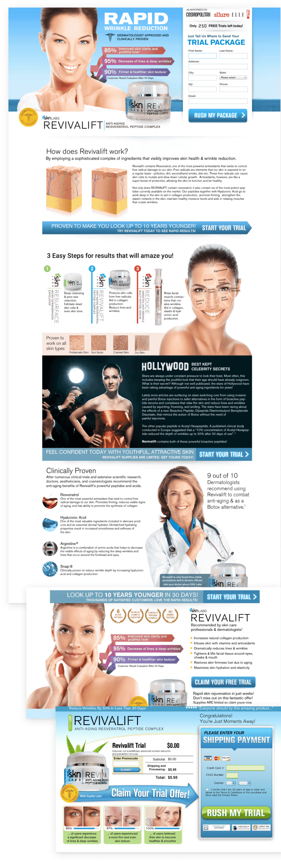
Led the campaign creative for SKN Labs — digital and print — designed to communicate the peptide-blend efficacy story in visual terms. Campaign assets had to work across paid digital channels and in-store environments, maintaining the premium look and feel of the brand at every touchpoint.
- Digital and print campaign assets
- Product photography direction
- CRM design and management