Two brands, one ecosystem - built for the riders who depend on it

A culture as much as a market
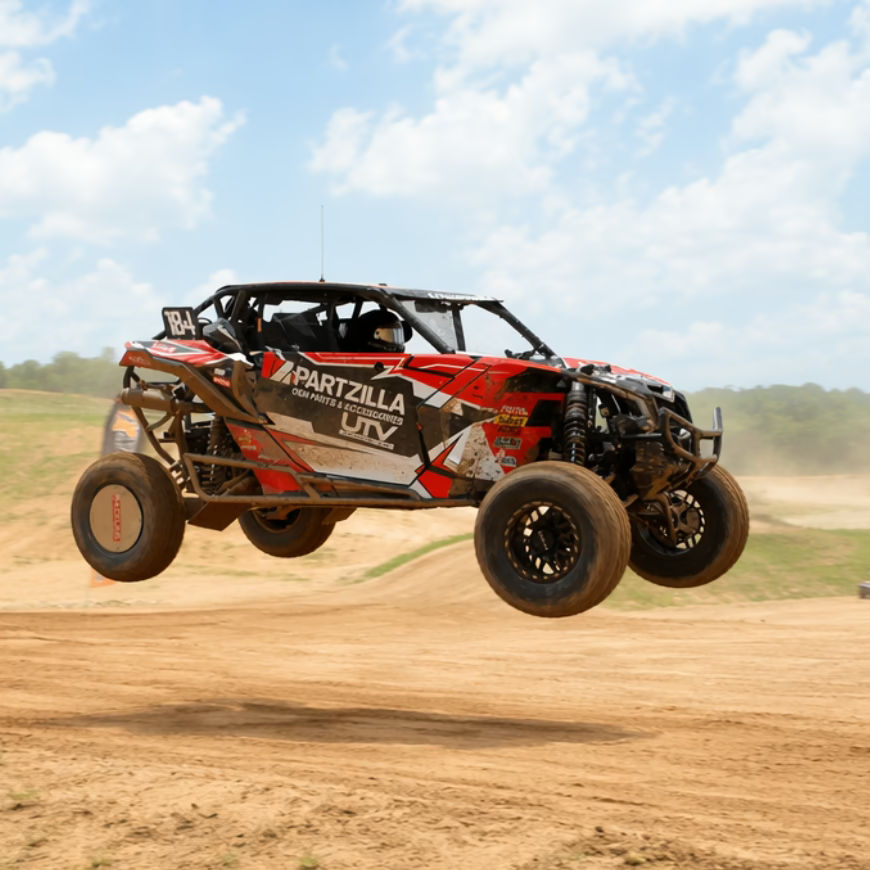
Powersports isn't a passive category. The people buying OEM replacement parts are riders, mechanics, and enthusiasts who know exactly what they need and have zero patience for a digital experience that wastes their time. The brand had to feel native to that world — rugged, direct, and credible — or it wouldn't land at all.
At the same time, Partzilla's core function is pure utility: a vast, searchable catalogue of OEM parts across dozens of makes, models, and years. With an inventory of that scale, the information architecture had to be genuinely excellent. Brand credibility means nothing if users can't find the part.
One system, two distinct voices
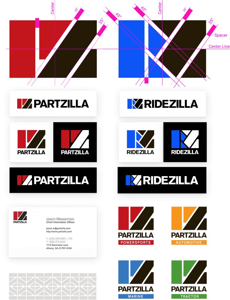
I built both brands from the ground up as a coherent family — distinct enough to serve different functions, connected enough to feel like a unified ecosystem. Partzilla is the parts platform, the engine of the business: bold, purposeful, and unambiguous. Ridezilla is the dealership face: same roots, slightly more experience-led register.
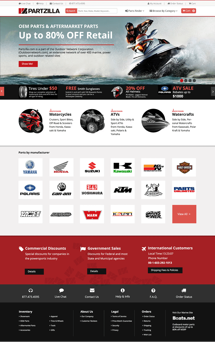
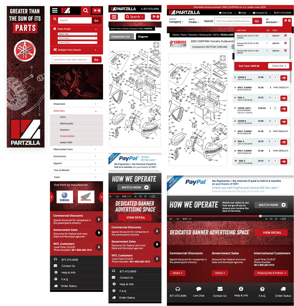
Alongside the brand work, I redesigned the full Partzilla site — rebuilding the hierarchy and navigation from the ground up to make a genuinely massive inventory feel immediately searchable and navigable for users who arrive knowing exactly what they need.
A 9-million-order business with a brand to match
The Partzilla brand gave a high-volume, category-defining platform a visual identity that finally matched its market position. The redesigned site made a genuinely massive inventory feel navigable — built for users who arrive knowing exactly what they need and expect to find it fast.
Ridezilla launched as a credible companion brand within the same ecosystem, extending the Outdoor Network's reach into the dealership space. Partzilla and Boats.net have continued to operate as two of the most prominent OEM parts platforms in the US powersports and marine markets — a foundation built in part on the brand system and digital experience established in 2012.
I built both brands from the ground up as a coherent family — distinct enough to serve different functions, connected enough to feel like a unified ecosystem.
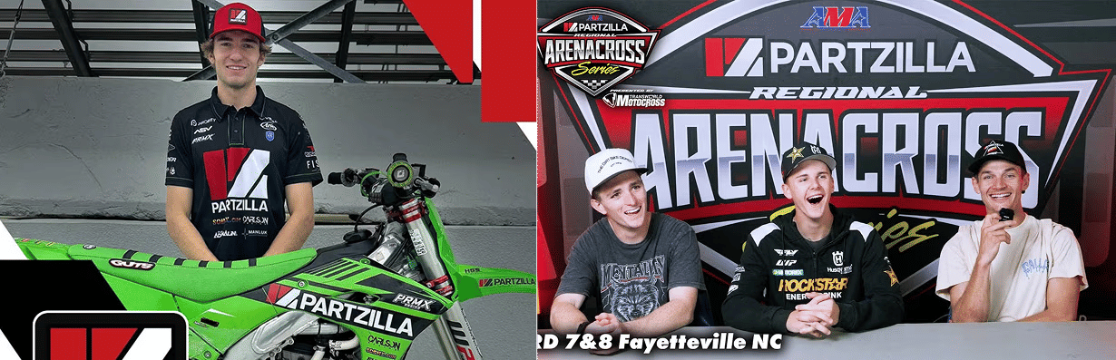
Partzilla is the parts platform — the engine of the business. The visual identity needed to reflect its scale while resonating with the rugged, outdoors-focused riders who depend on it. Bold, purposeful, and unambiguous: a brand that felt native to the powersports world rather than imposed on it.
Ridezilla is the dealership brand. I developed the Ridezilla identity to sit clearly within the Zilla family while standing on its own as a credible dealership brand.
- Full brand identity for Partzilla — logo, color, type, tone of voice, and guidelines
- Ridezilla identity designed within the same brand architecture — different register, same family
- Complete website redesign — information architecture, UI, and front-end development
- Brand guidelines covering digital, print, and advertising for both platforms
The existing site had an inventory problem disguised as a design problem. With millions of parts across countless makes, models, and years, the navigation had grown into something users had to fight rather than use. I redesigned the full site structure and UI — building a clearer hierarchy, more intuitive search pathways, and a visual language that let the products do the talking without burying them in noise.
- Full website redesign — structure, hierarchy, and visual design
- Information architecture for high-SKU OEM parts catalogue
- UI designed for the practical, efficiency-focused powersports buyer
- Front-end development across the redesigned site