A health insurance marketplace built for people, not brokers


Millions of people suddenly shopping for insurance alone for the first time
In 2013, the Affordable Care Act upended the US health insurance market. Millions of Americans had to shop for plans on their own for the first time — and the experience waiting for them was confusing, cold, and built for insurance brokers, not people.
The opportunity was clear: build something that felt like a consumer fintech product rather than a government portal. The challenge was equally clear — health insurance is genuinely complex, and getting the UX wrong in a high-stakes decision context doesn't just frustrate users, it costs them real money.
Consumer-first design in a category that had never tried it
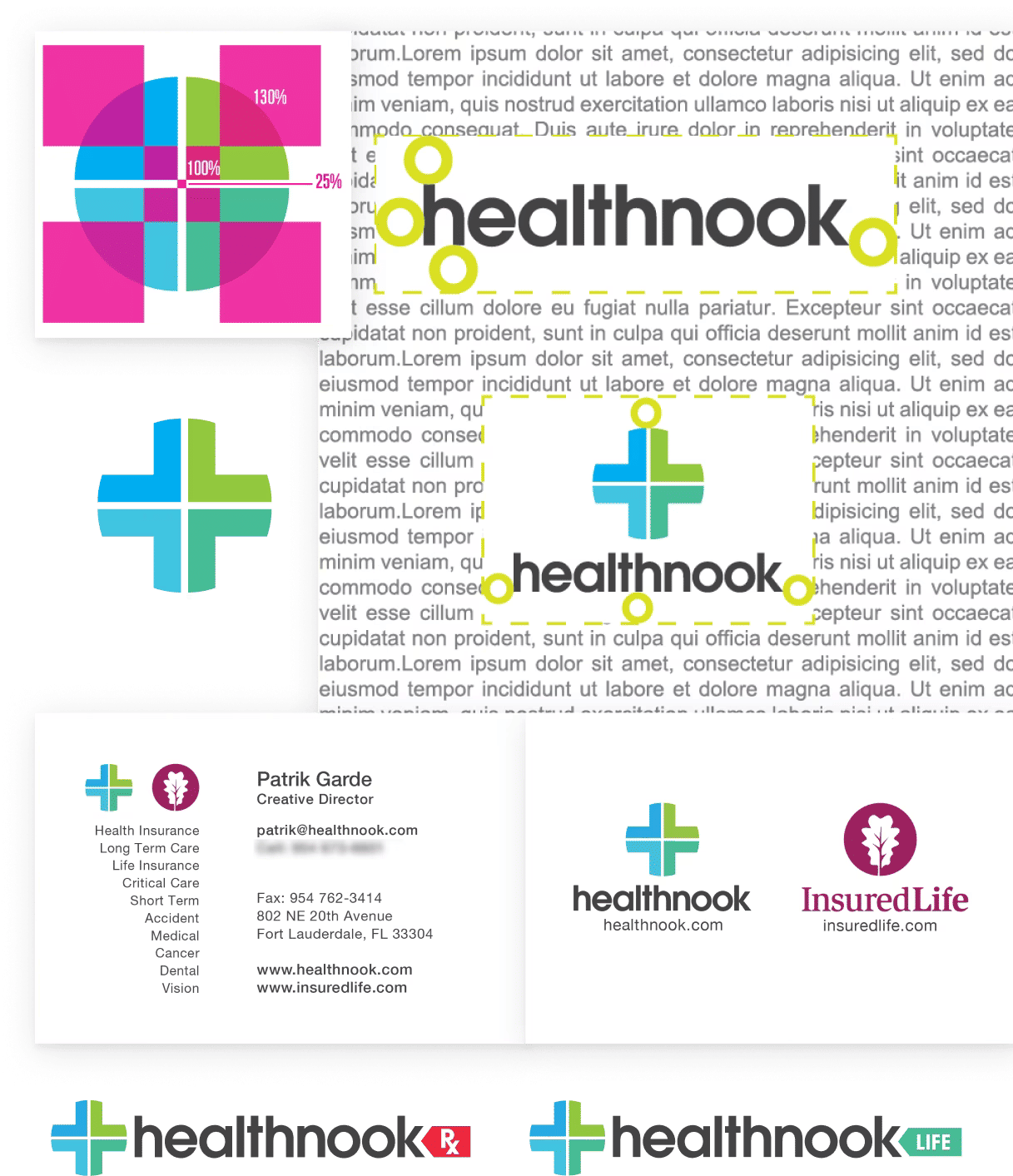
I spearheaded the design of Healthnook, leading all aspects from brand identity to the full marketplace application. The brand was built around the idea of modern health, family values, and genuine trustworthiness: approachable without being frivolous, clear without being cold.
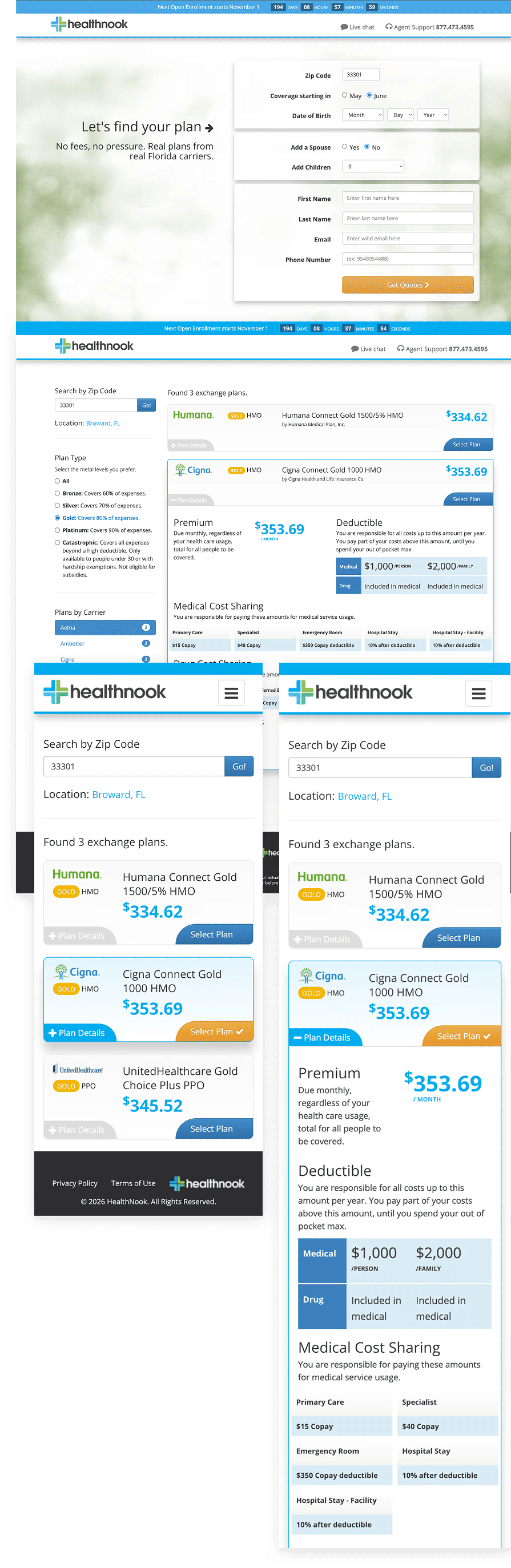
The marketplace was where the real UX challenge lived. Turning health insurance — a product category notorious for complexity — into something a non-expert could compare, evaluate, and act on required careful information architecture and a comparison interface that reduced cognitive load at every step. I designed and built the front-end myself.
$6M in revenue — proof that design differentiates in high-friction markets
Healthnook generated $6M in revenue during its operating year and demonstrated that consumer-friendly design could meaningfully differentiate in a category that had historically ignored the end user. The platform worked — clear, functional, and trusted by the people navigating one of the most consequential financial decisions of their year.
After a year of operation, we made the decision to shift focus when a compelling opportunity opened up with eTags.com. The Healthnook platform remained a proof of concept for what thoughtful product design can do in a high-friction, high-stakes market.
I created the Healthnook brand from scratch — identity, visual system, and tone of voice — built around the idea of modern health, family values, and trustworthiness. The brand needed to work across both a consumer-facing marketing site and a marketplace application without ever feeling clinical or corporate.
To support the business model, I also launched InsuredLife as an in-house insurance agency sub-brand — a natural extension of Healthnook's positioning, aligned in look and feel but clearly differentiated in purpose.
- Full brand identity and visual system for Healthnook — logo, color, type, guidelines
- InsuredLife sub-brand designed and positioned within the same brand architecture
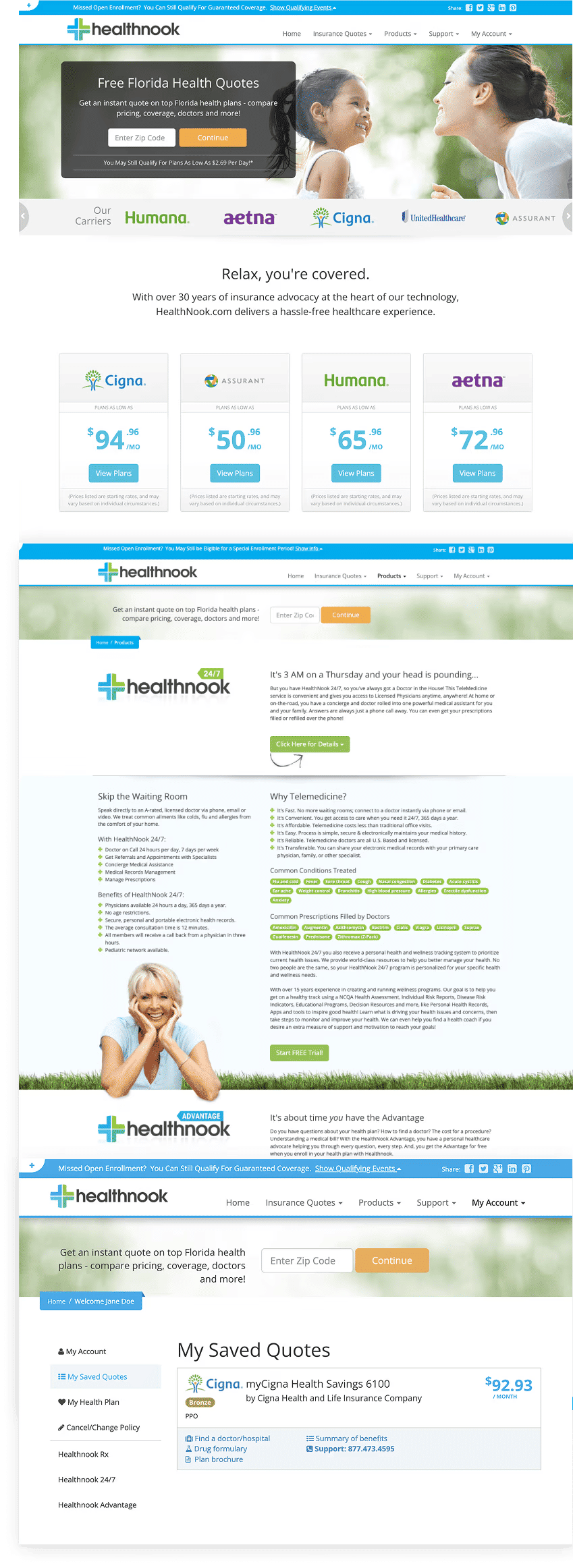
- Consumer marketing site — architecture, design, copywriting direction, and front-end
- Marketplace application — plan browse, compare, and enroll — designed and built in-house
The marketing site was the first thing a confused, first-time insurance shopper would see. I designed and built it to feel nothing like an insurance site — approachable in tone, minimal in layout, and structured to answer the questions people actually had before asking them to do anything.
- Consumer-facing site architecture and copywriting direction
- Clear information hierarchy guiding users toward plan comparison
- Responsive front-end built for speed and accessibility
- Designed to convert anxiety into confidence
The marketplace was where the real UX challenge lived — turning a genuinely complex product (health insurance) into something a non-expert could compare, evaluate, and act on. I designed the full comparison interface, plan detail views, and enrollment flow, then built the front-end myself.
- Full UI system for plan browse, compare, and enroll
- Designed to reduce cognitive load across a high-stakes decision
- Front-end development across the full application
- Enrollment flow optimized for clarity and conversion